The Challenge:
To create packaging design that will stand out when sitting on the shelf. To have a design that with draw in more costumers.
The Planning:
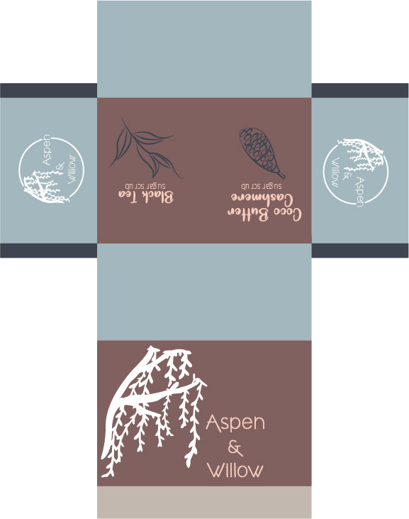
The packaging design began with brain storming what was the most important products for soap companies to offer. The next step was to create the best shaped packing for each product. And from there the design process began.
The Design Concept:
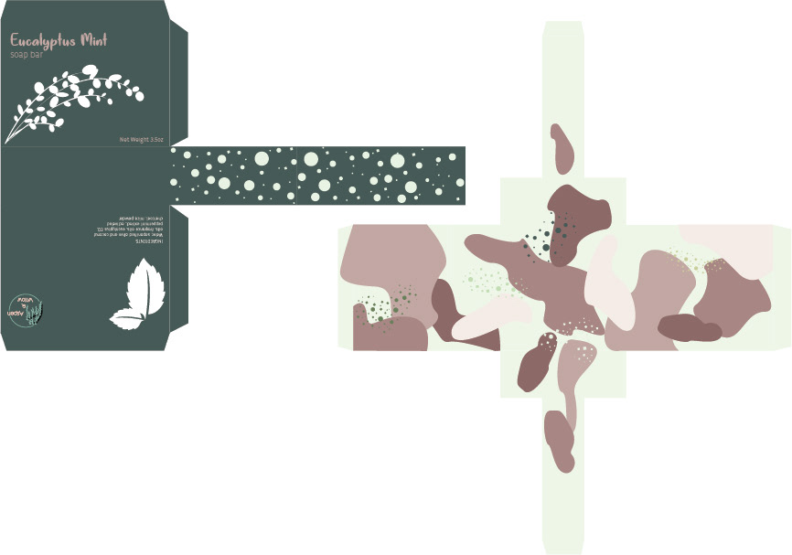
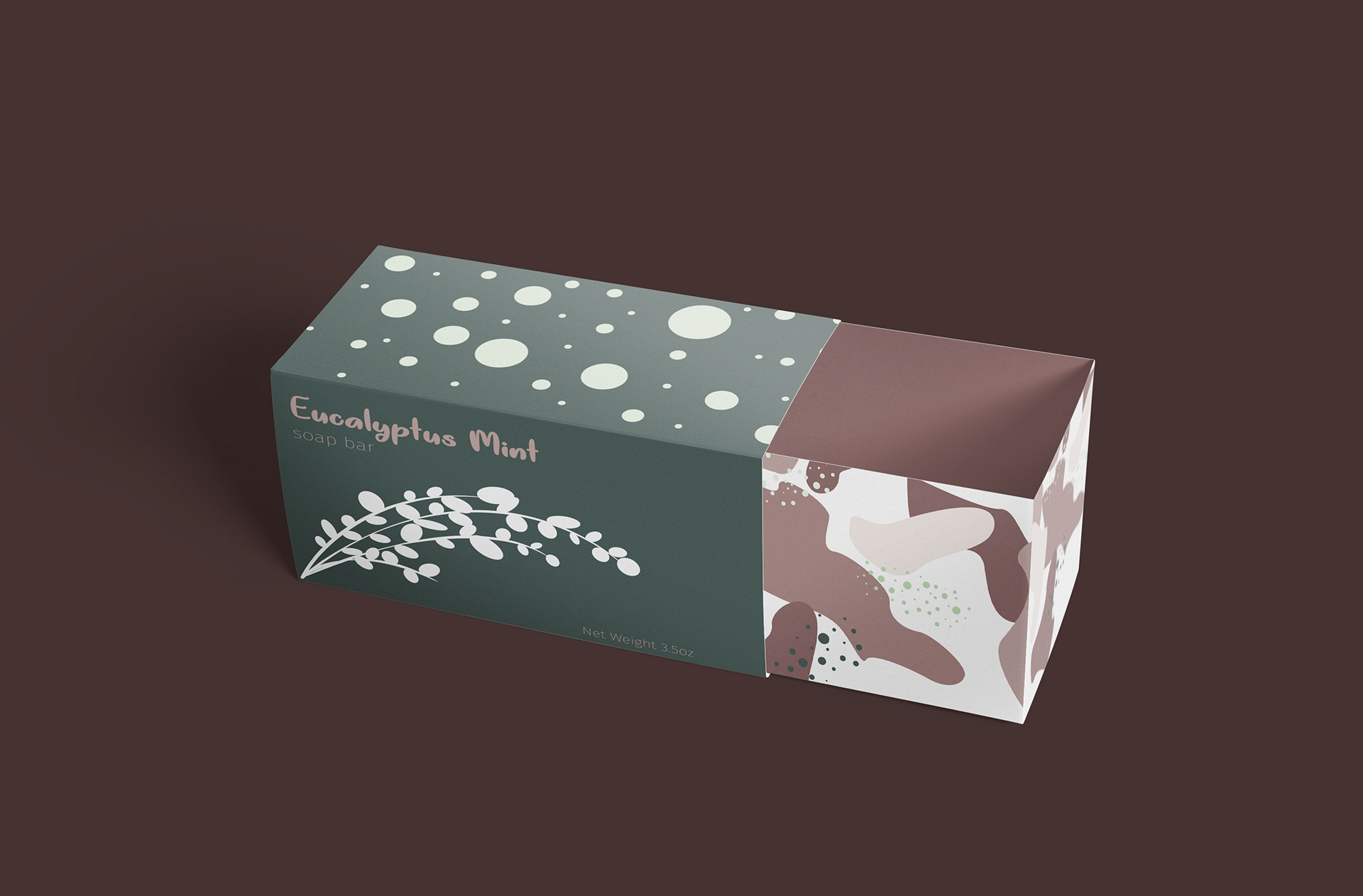
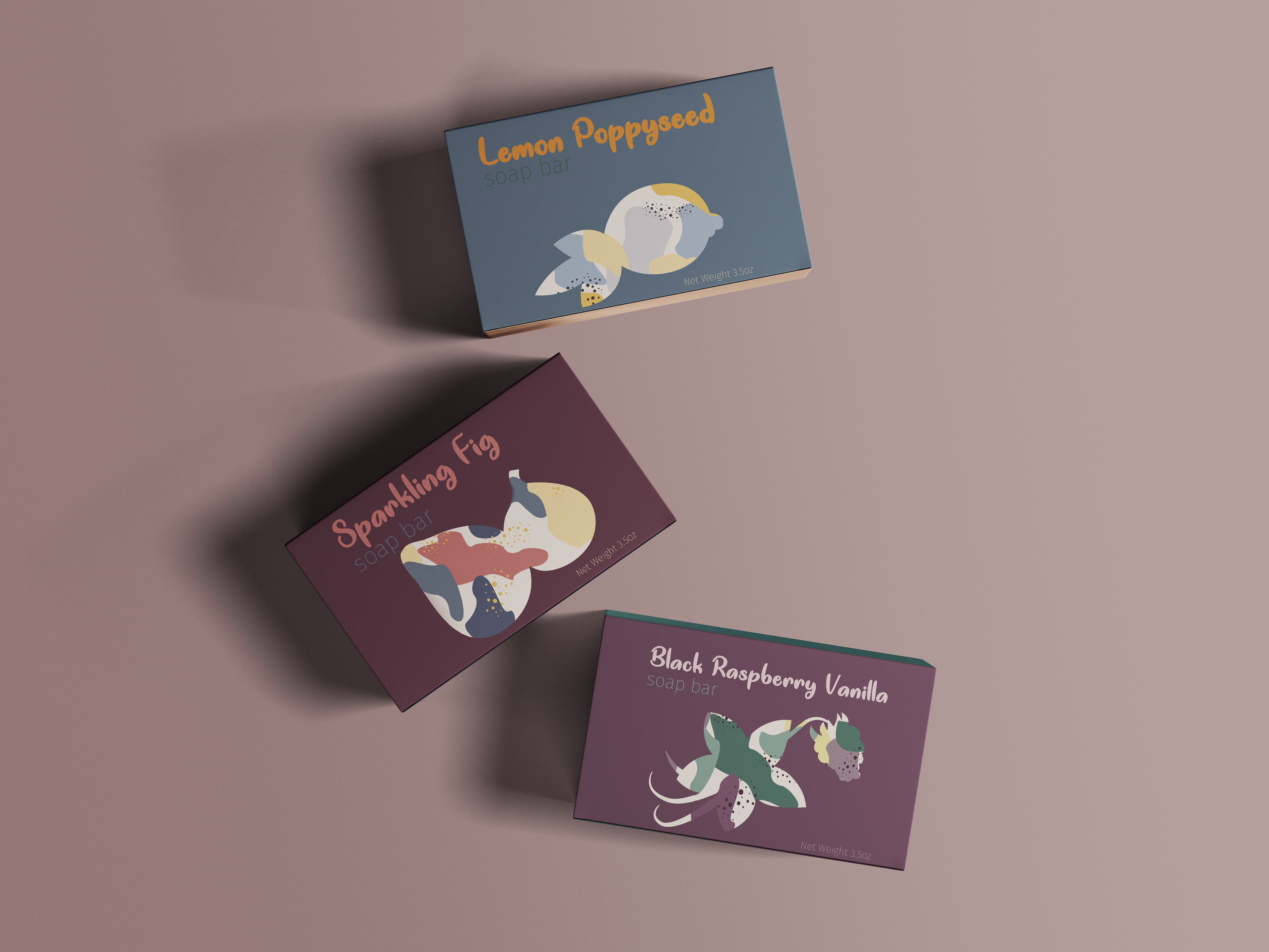
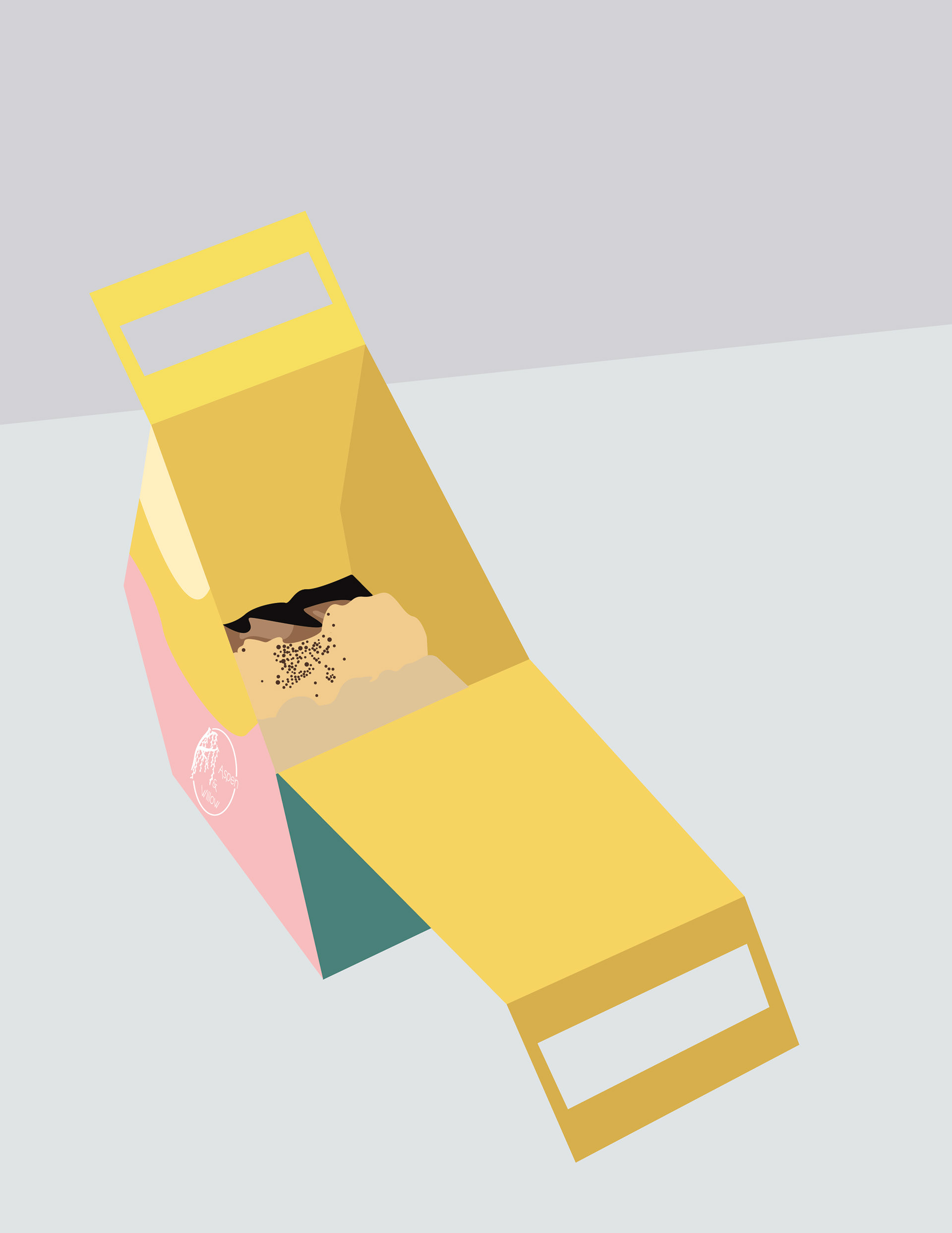
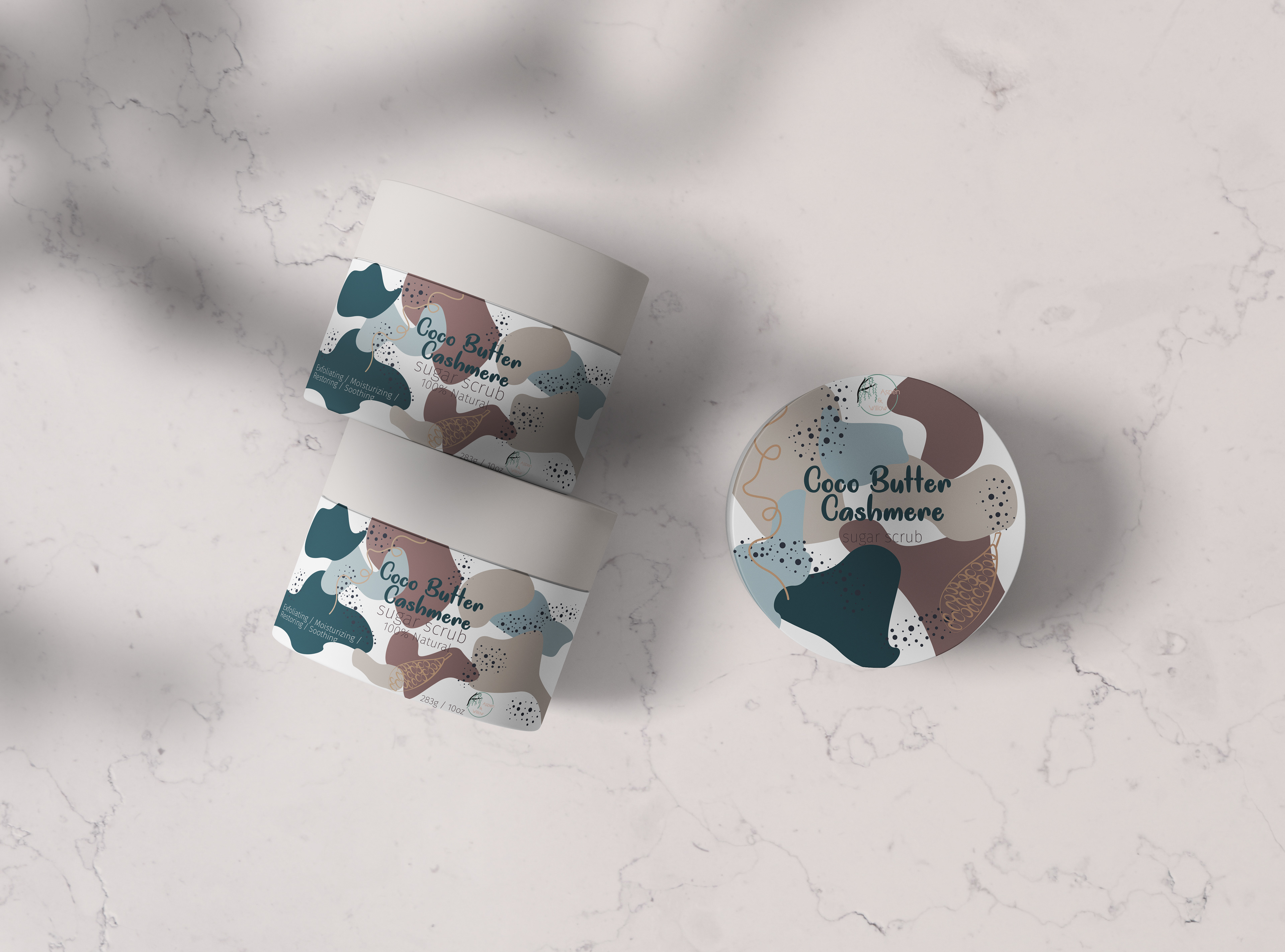
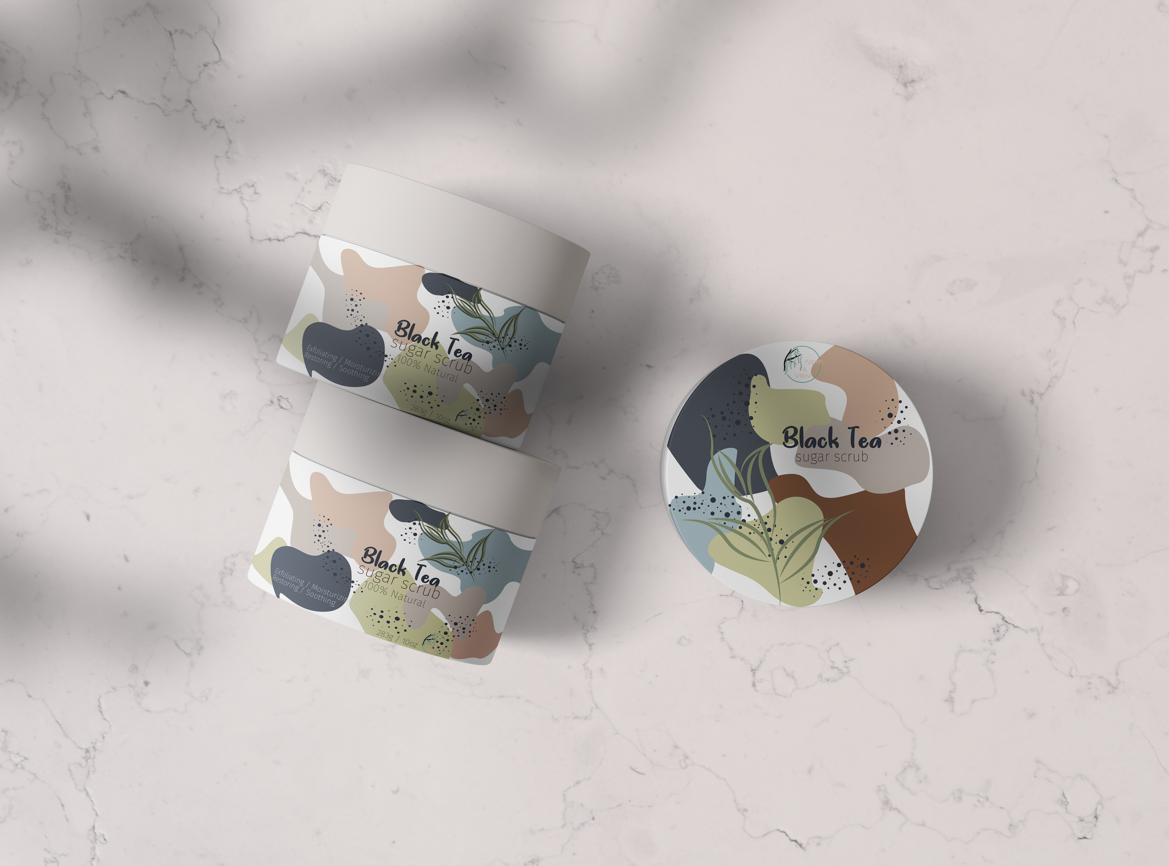
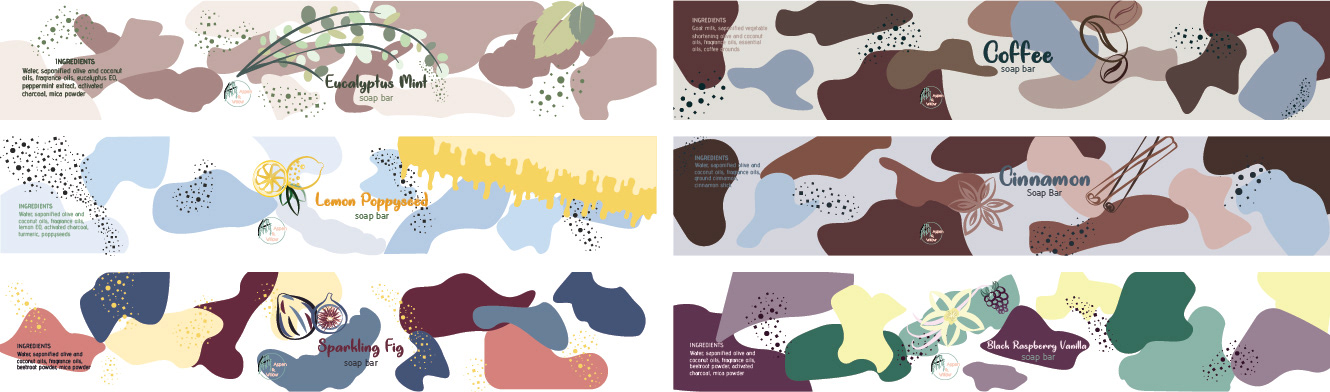
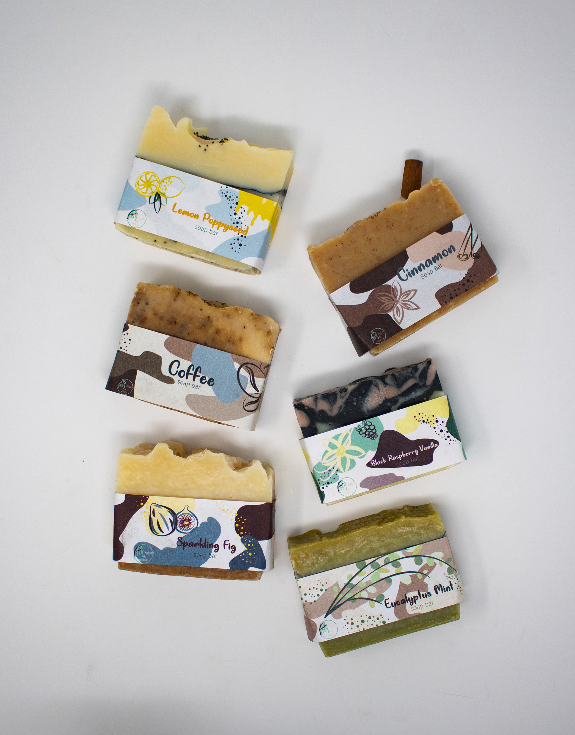
When thinking of what would make the design stand out as well as have the feel of an organic company. I wanted to create its own unique colors for the brand its self, but also creating a color scheme for each different cent, and the ingredients used in the product. In changing the colors I wanted to make sure that the very organic shapes and patterns stayed the same throughout the hole thing. So it would still be recognized as the same company.
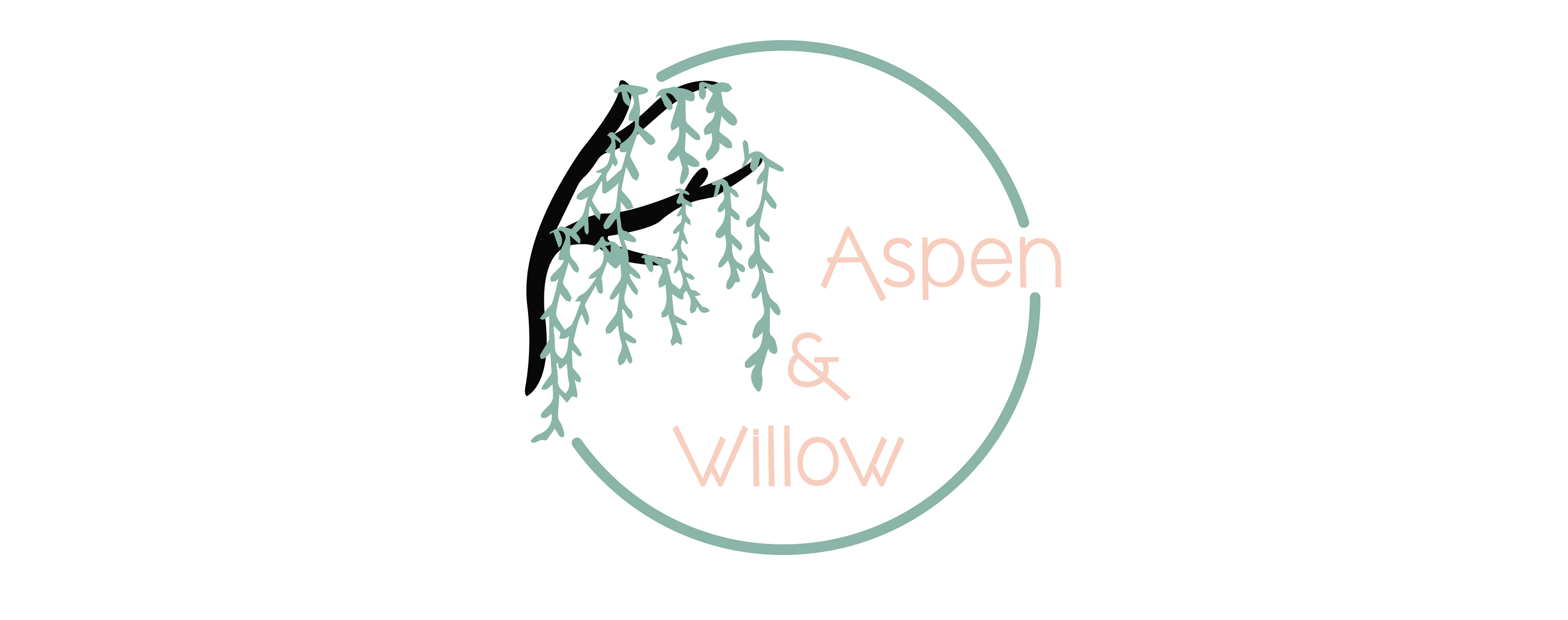
Colors and Fonts
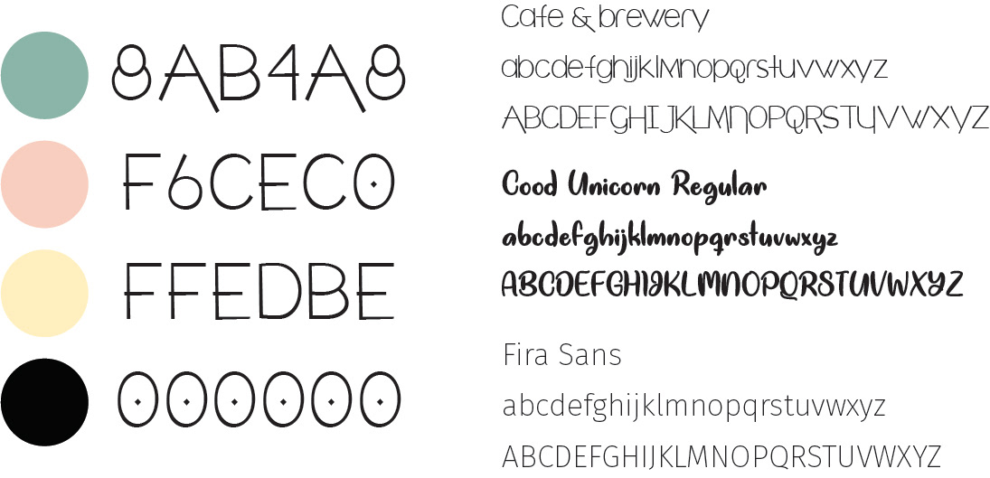
Visual Design:
The color palette features a lot of different colors based on the different ingredients in each product. Aspen & Willow’s font choices are Good Unicorn Regular, Cafe & Brewery, and Fira Sans. Good Unicorn Regular was used for titles to create a soft and fun feel to the design. Cafe & Brewery was used in the logo to create a professional look to the company. Fira Sans was used as a small not over whelming description of the products.
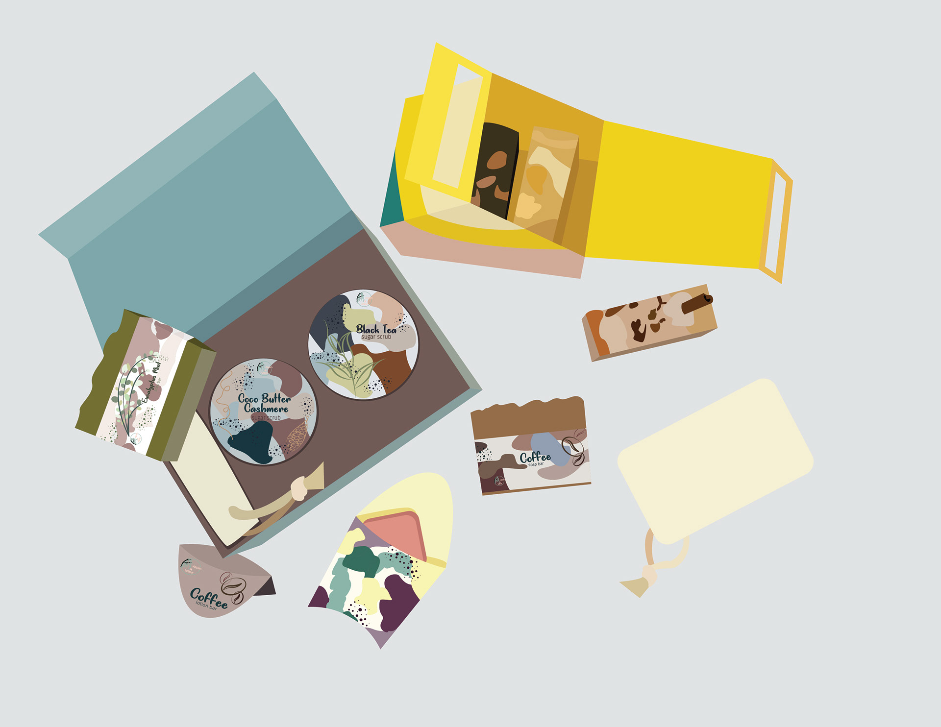
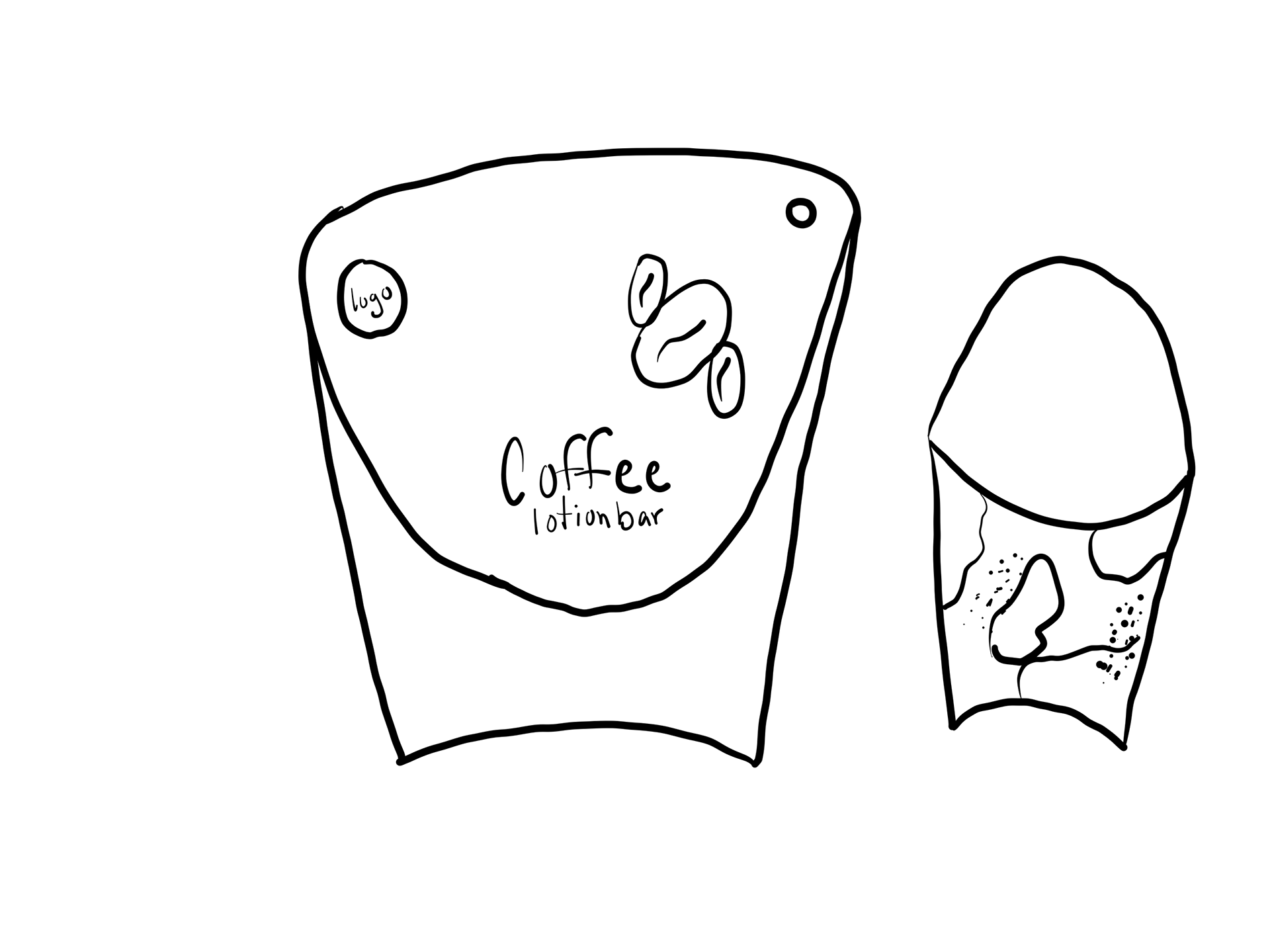
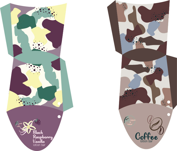
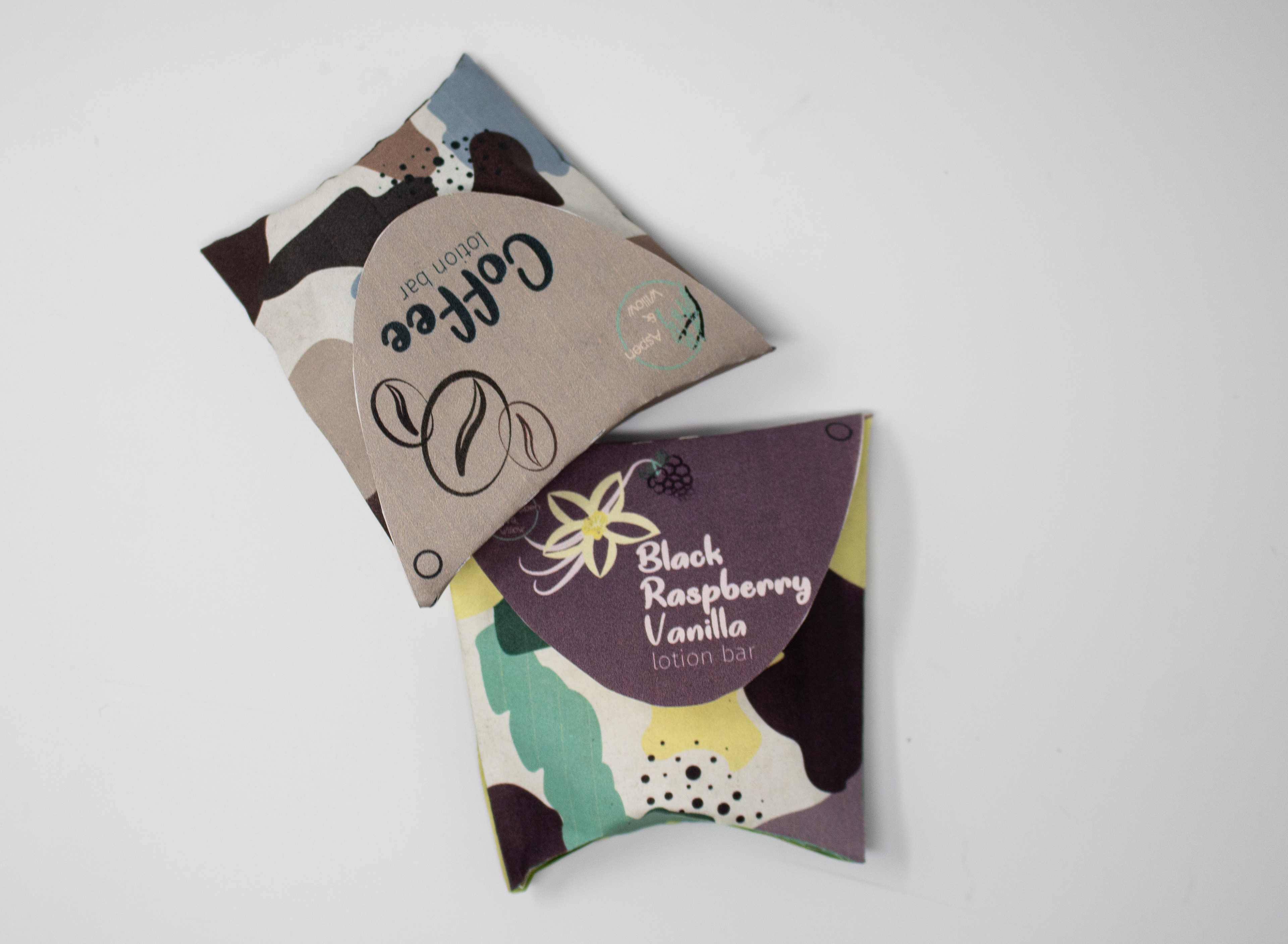
Lotion Bar
Summer Soap MultiPack
Sugar Scrubs
Sugar Scrub Pack
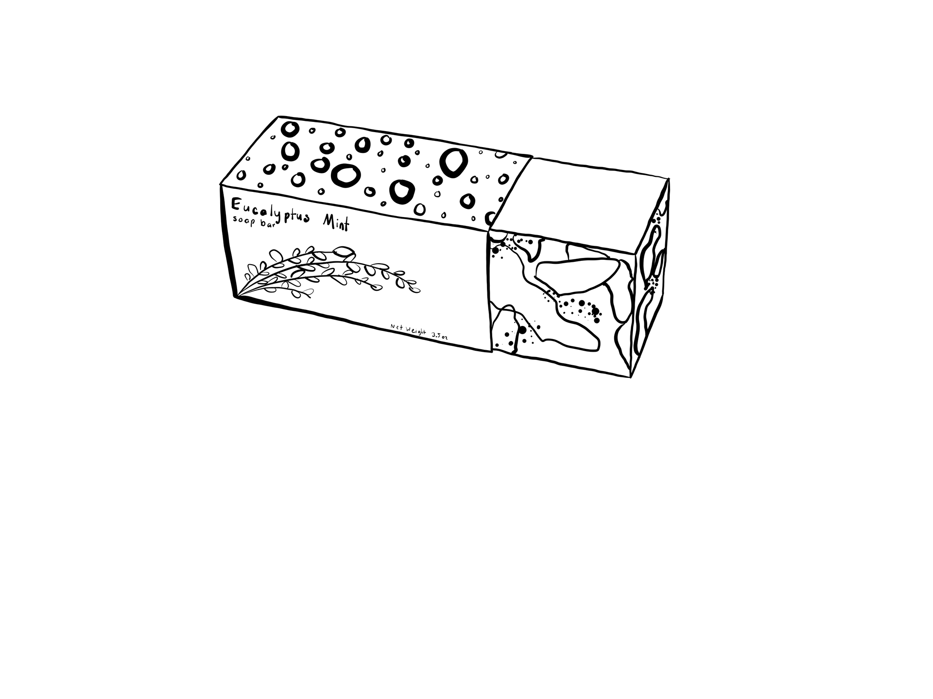
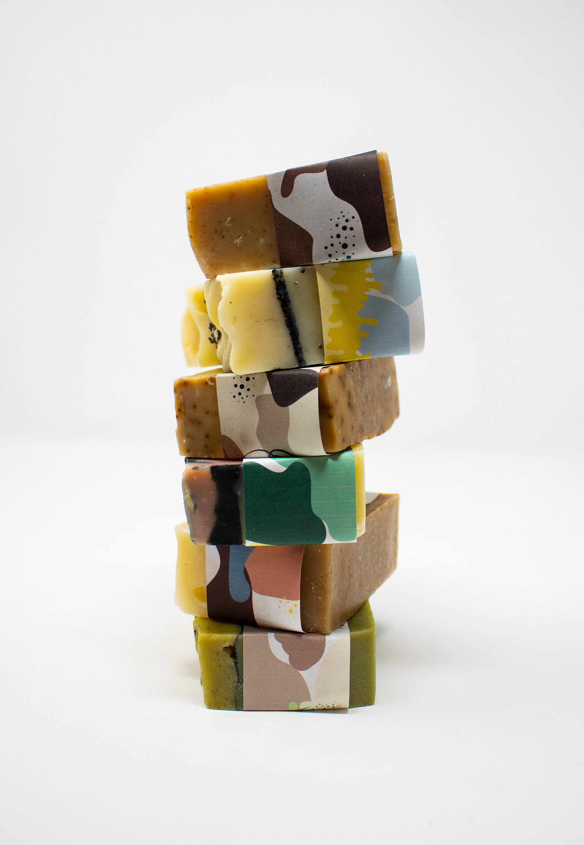
Soap Labels
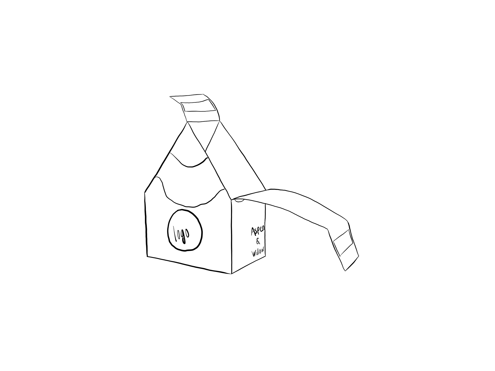
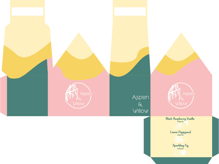
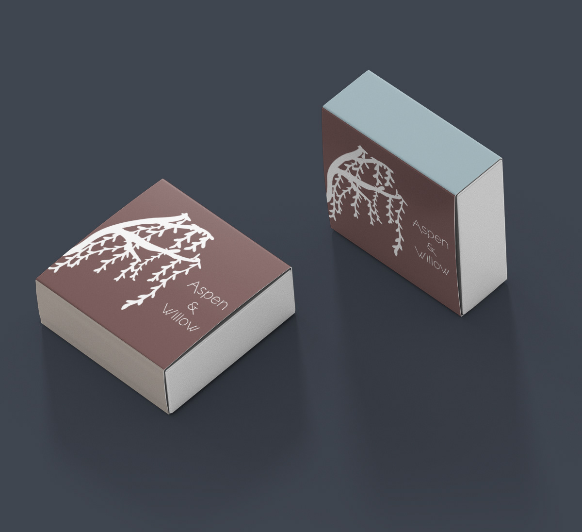
Soap Box