the story
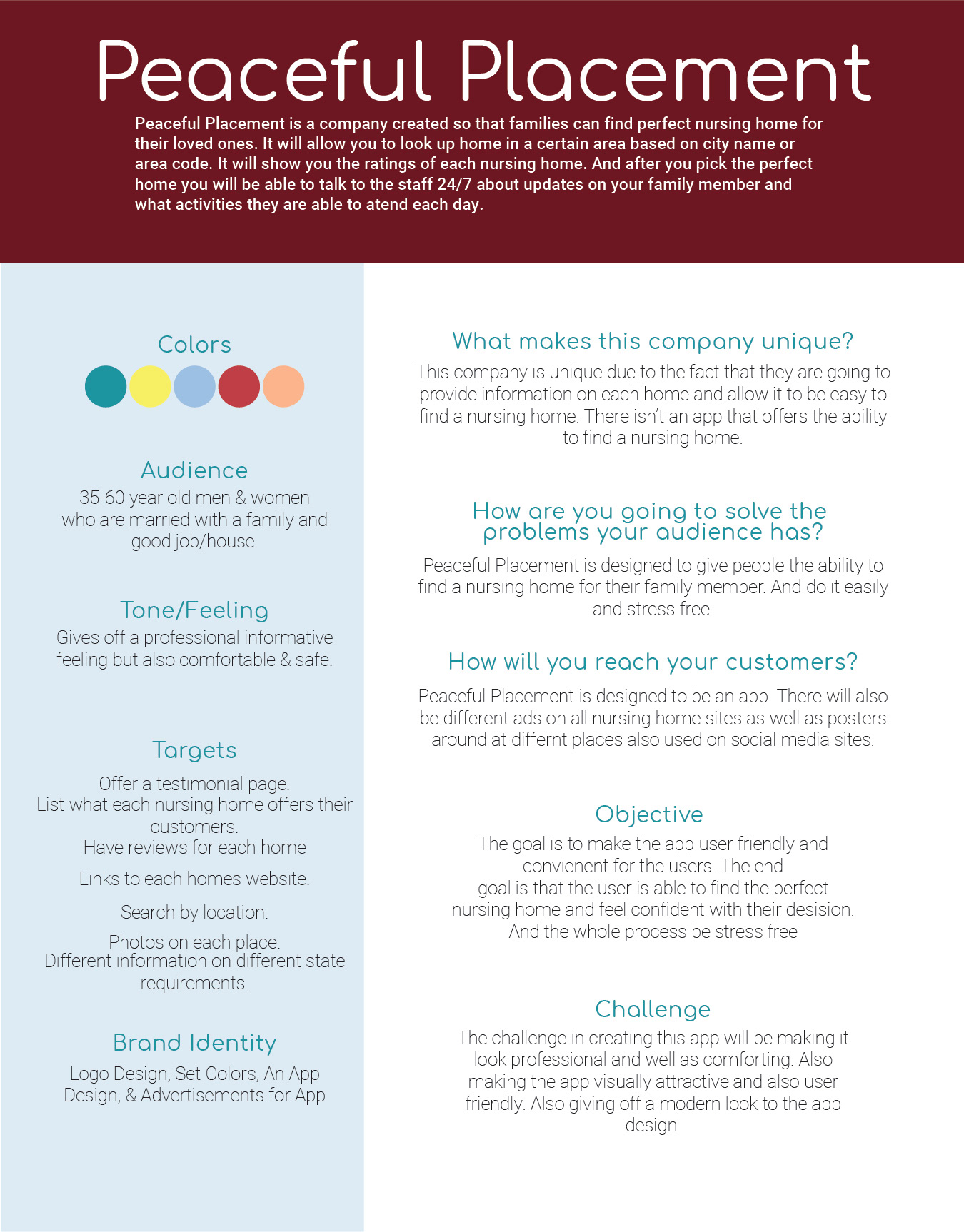
The app, Peaceful Placement, is going to make it easier for people to find a nursing home for their loved one. This app is designed for you to be able to search through different nursing homes based on location or ZIP code. You will see details about what the home offers, as well as reviews on the home. Once you find one you like, you can select it as a favorite. Then, either continue to search for other homes or virtually tour the home and finalize your decision.
What makes Peaceful Placement so unique and special is that once you find the perfect home, you will be able to communicate with the staff of the home regarding any questions or concerns you may have about your family member. You also have the ability to view a calendar of events for the home.
Project Brief
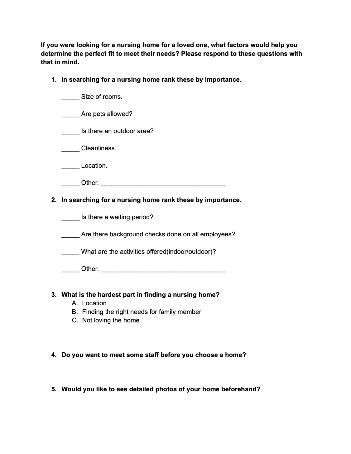
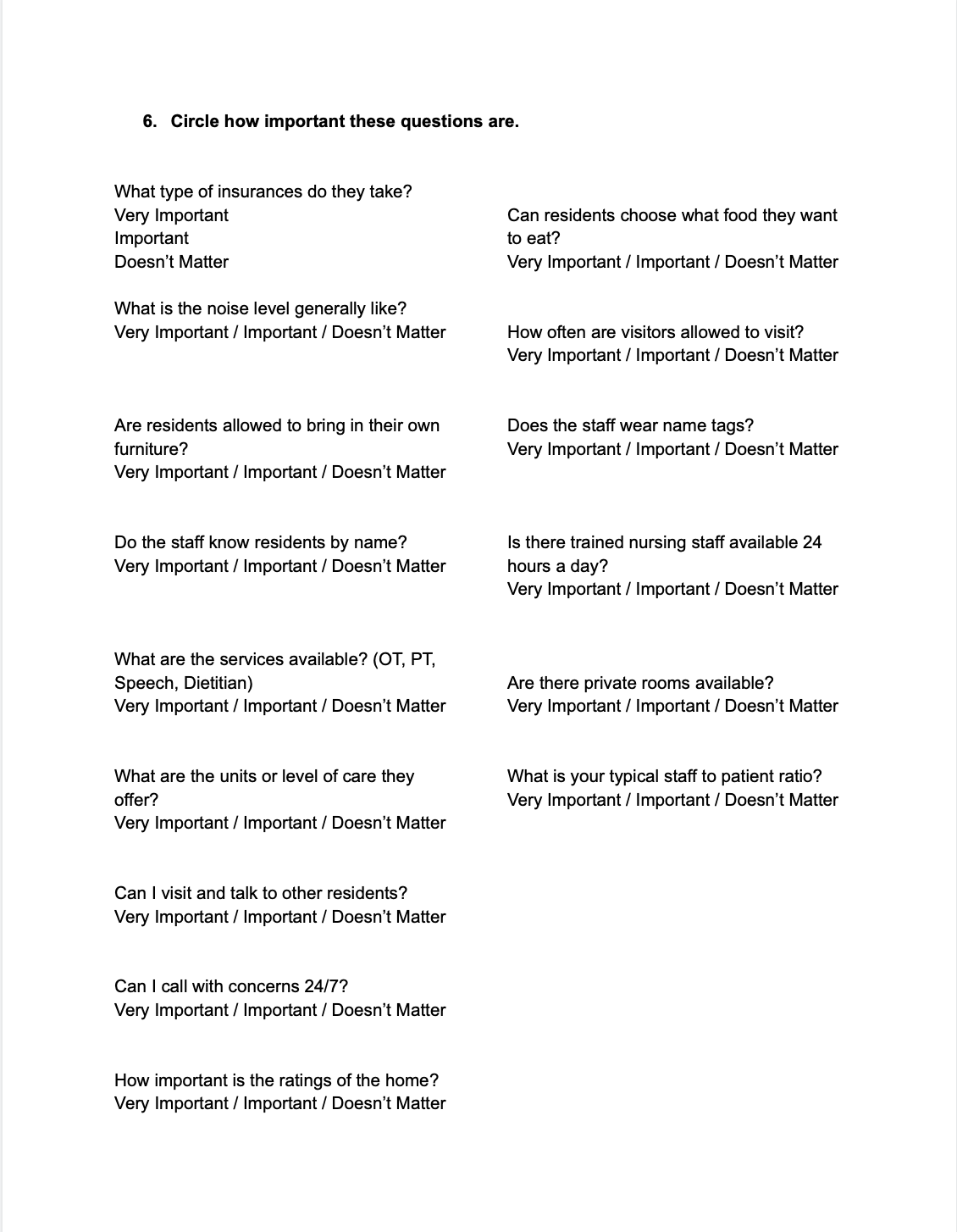
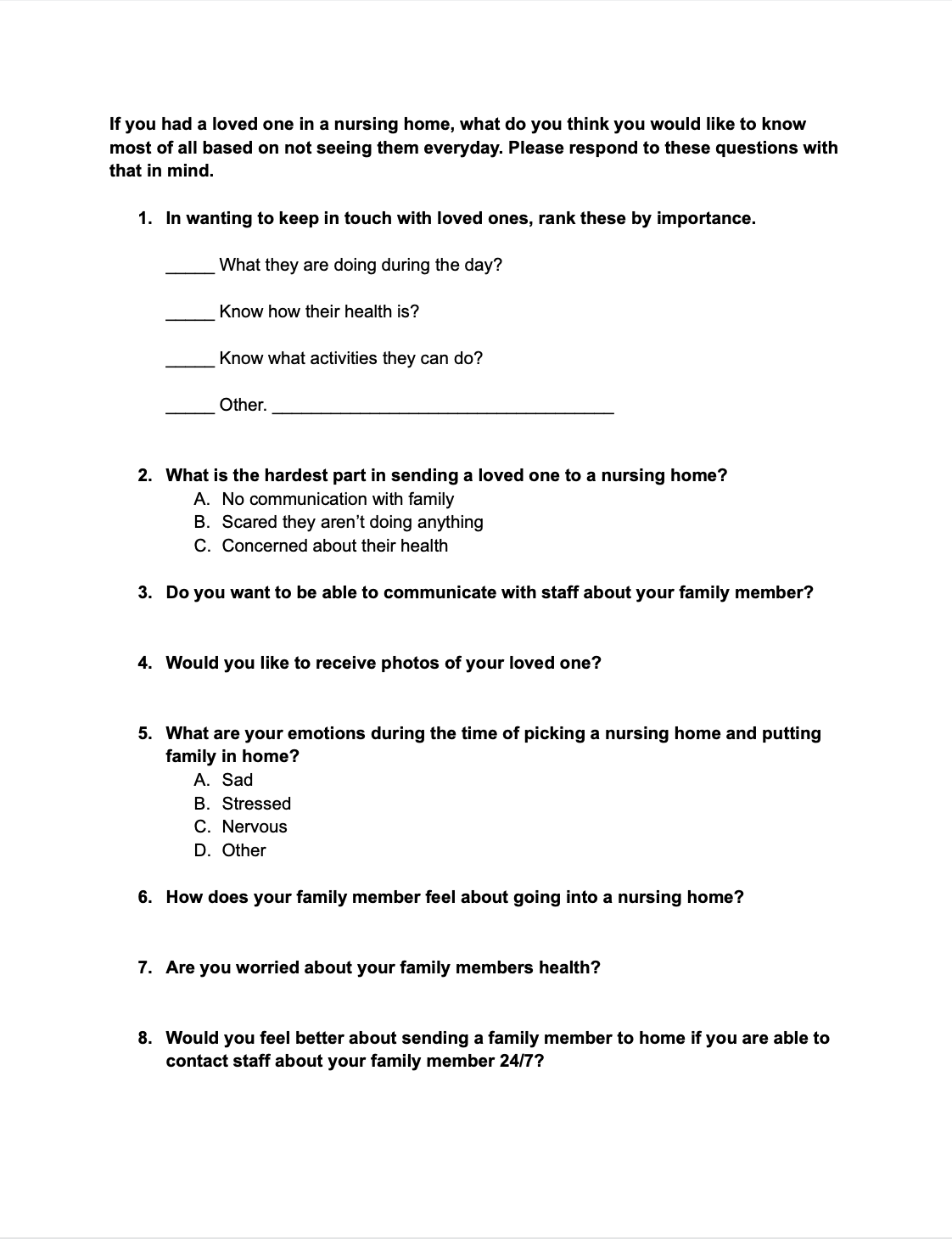
Surveys
After reading over the surveys, I found that most people want a soft modern feel to the app, as well as wanting to stay in touch with their loved one. This is a very sad and stressful process. The app would be sucessful if it were able to make this process smooth and easy. The look of the home is not as important as the feeling they get when visiting the home.
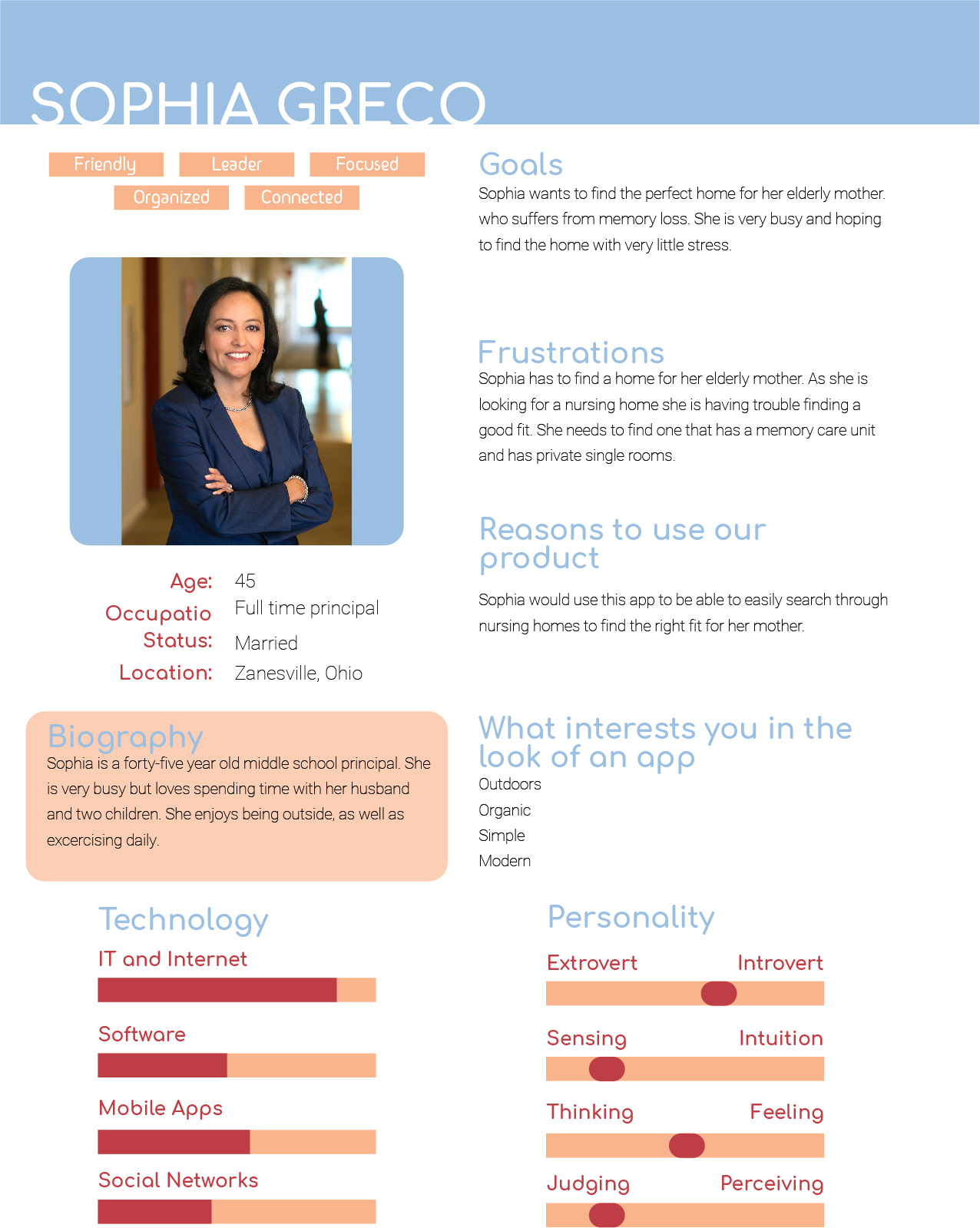
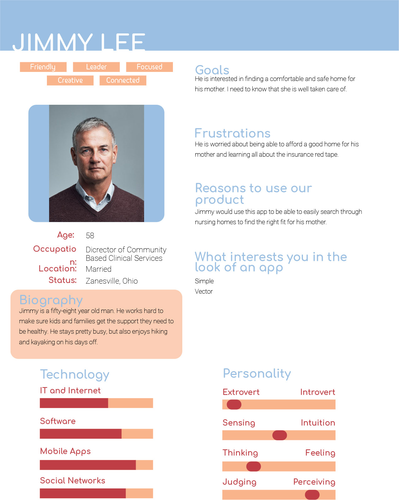
Personas
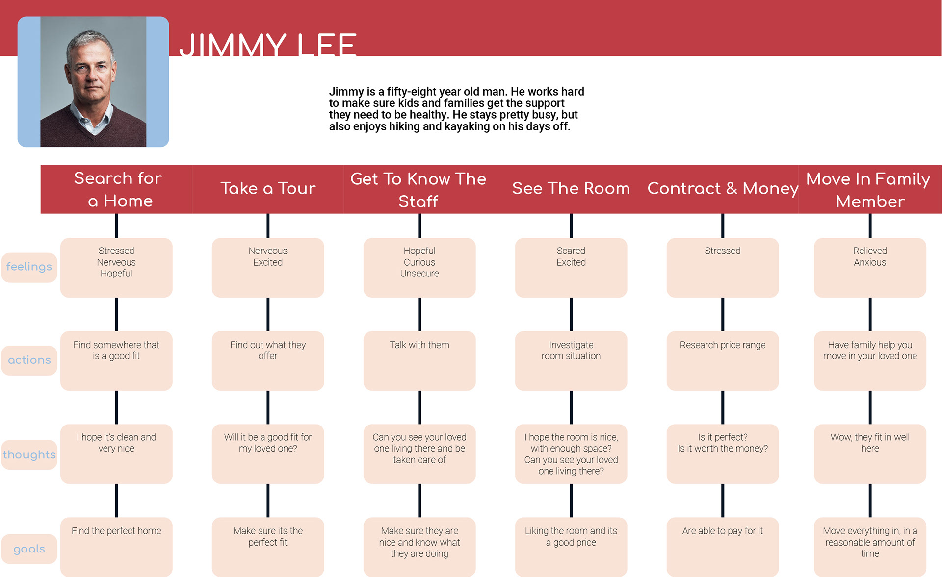
Journey Map
The journey map was created to show different scenarios that could happen while using the app and how the user would feel and react with every situation.
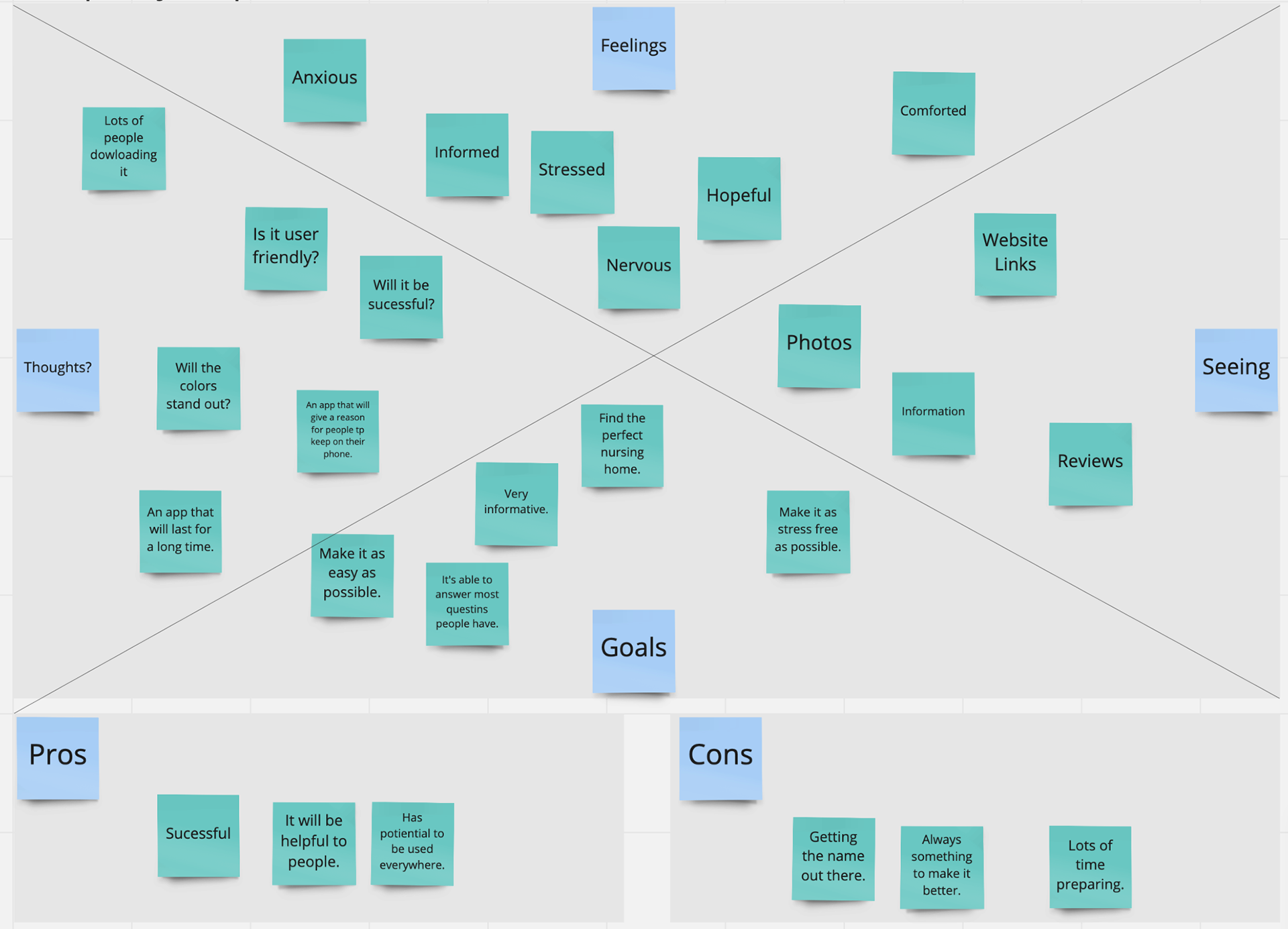
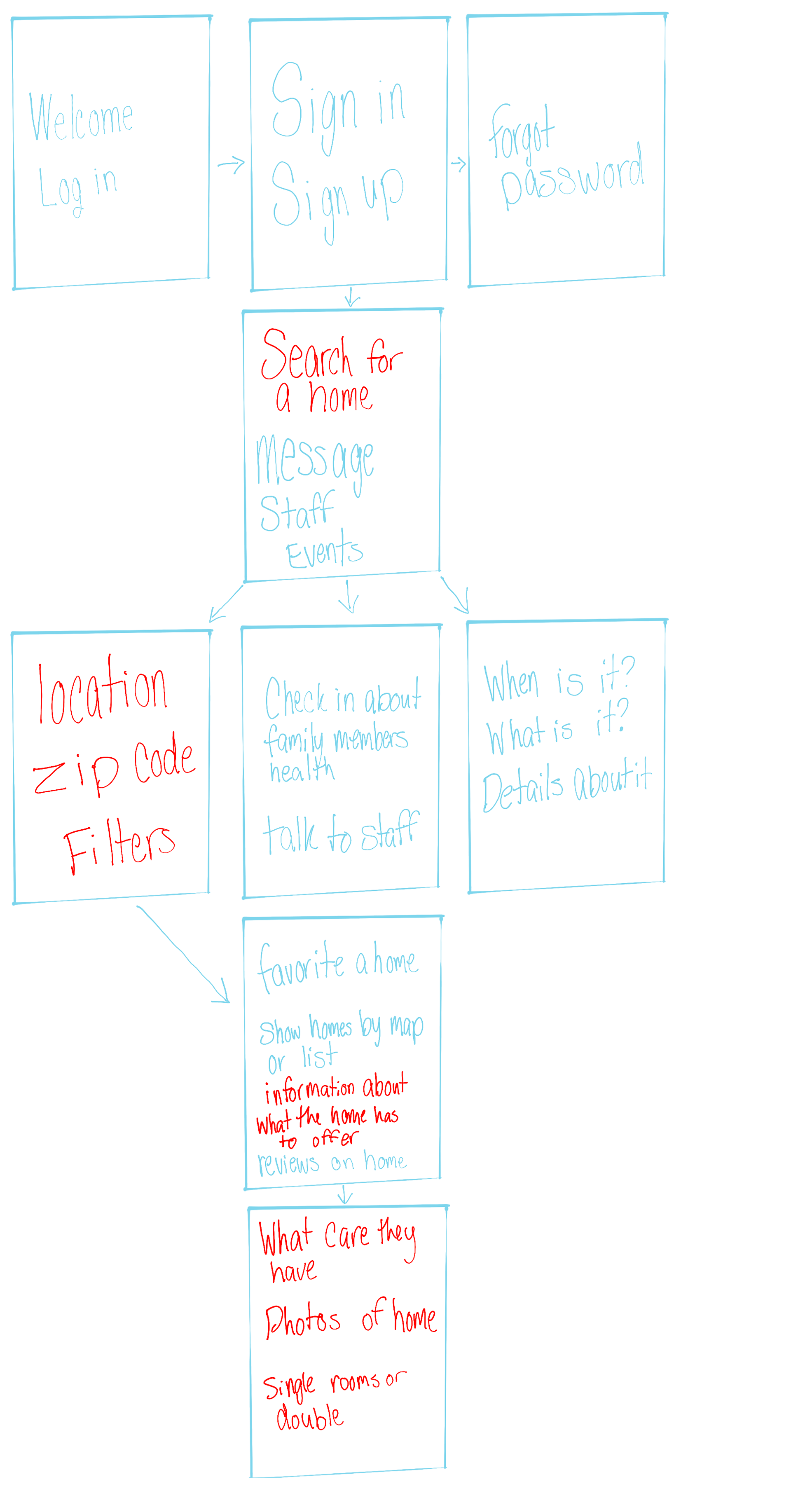
Empathy Map and User Flow
The empathy map is created to show the pros and cons of this app, figure out the app look and what the main goals in designing this app will be. And the user flow map is created to show how a user is easily going to move through your app from beginning to end. It also shows what is included with each step along the way.
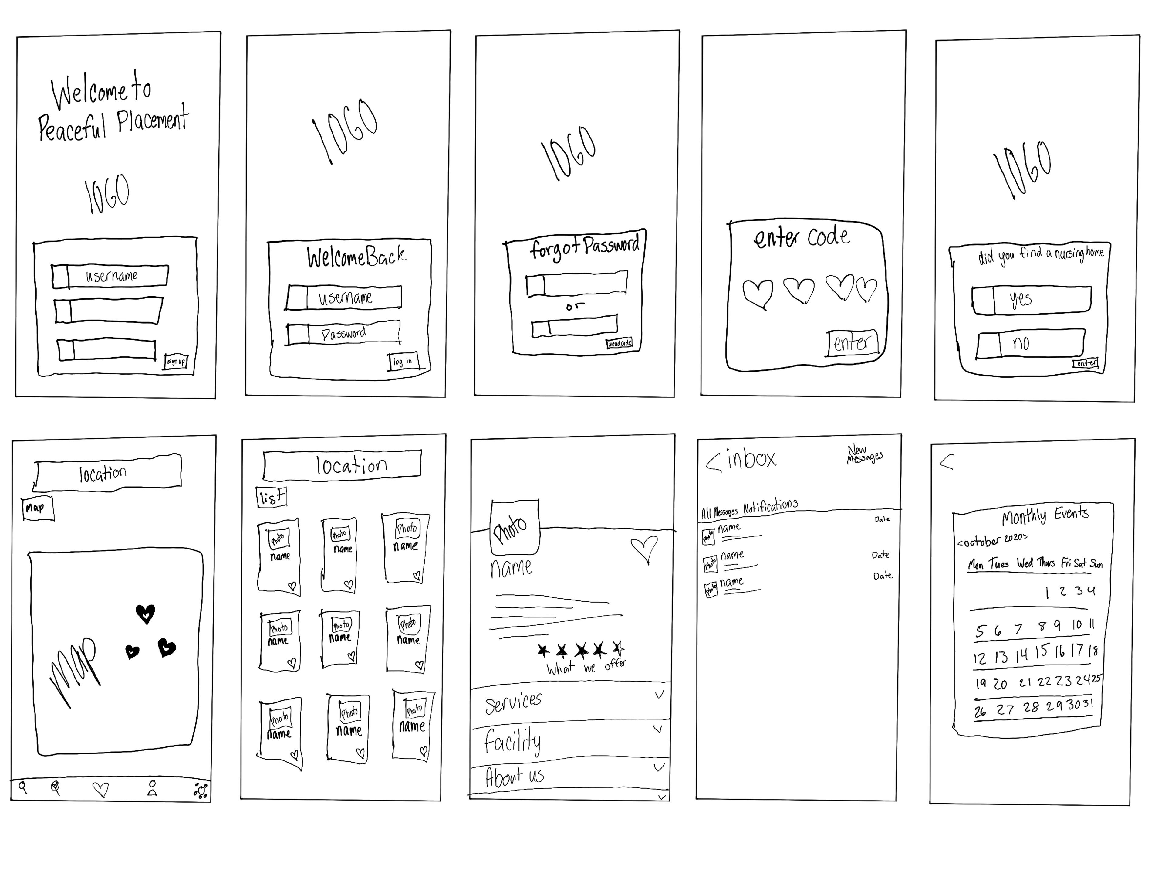
Wireframing
Wireframing is the process in your app design where you start sketching out how each page of your app will look, what movements will go with it, and what will come after each page.
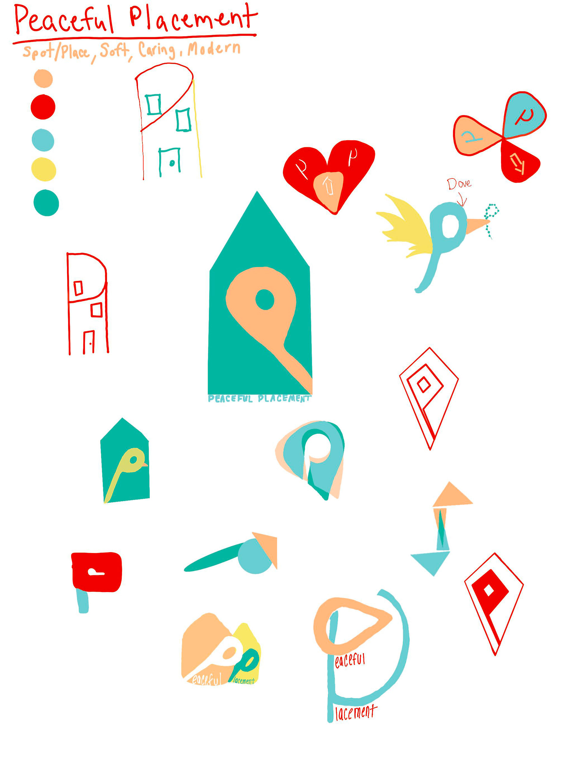
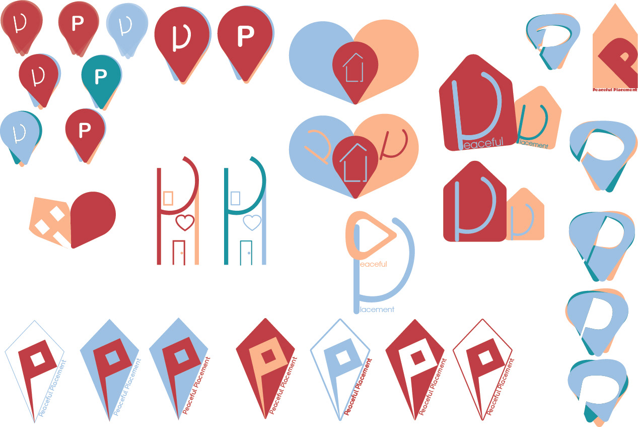
Logo Sketches
Spot/place, soft, caring and modern were the focus in creating the logo.
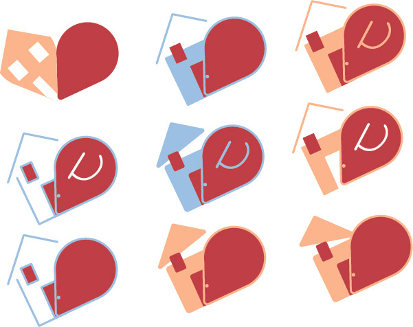
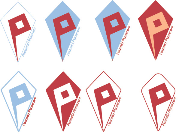
Logo Drafts
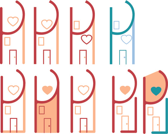
Final Logo design
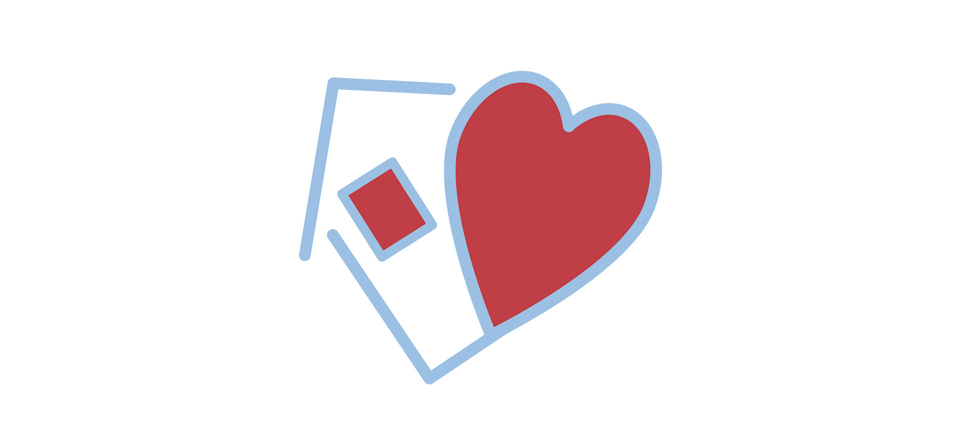
Included in the final logo is a house and a heart. The overall shape is designed to represent a bigger heart. The small heart in the logo is stretched out to be seen as a pin point.
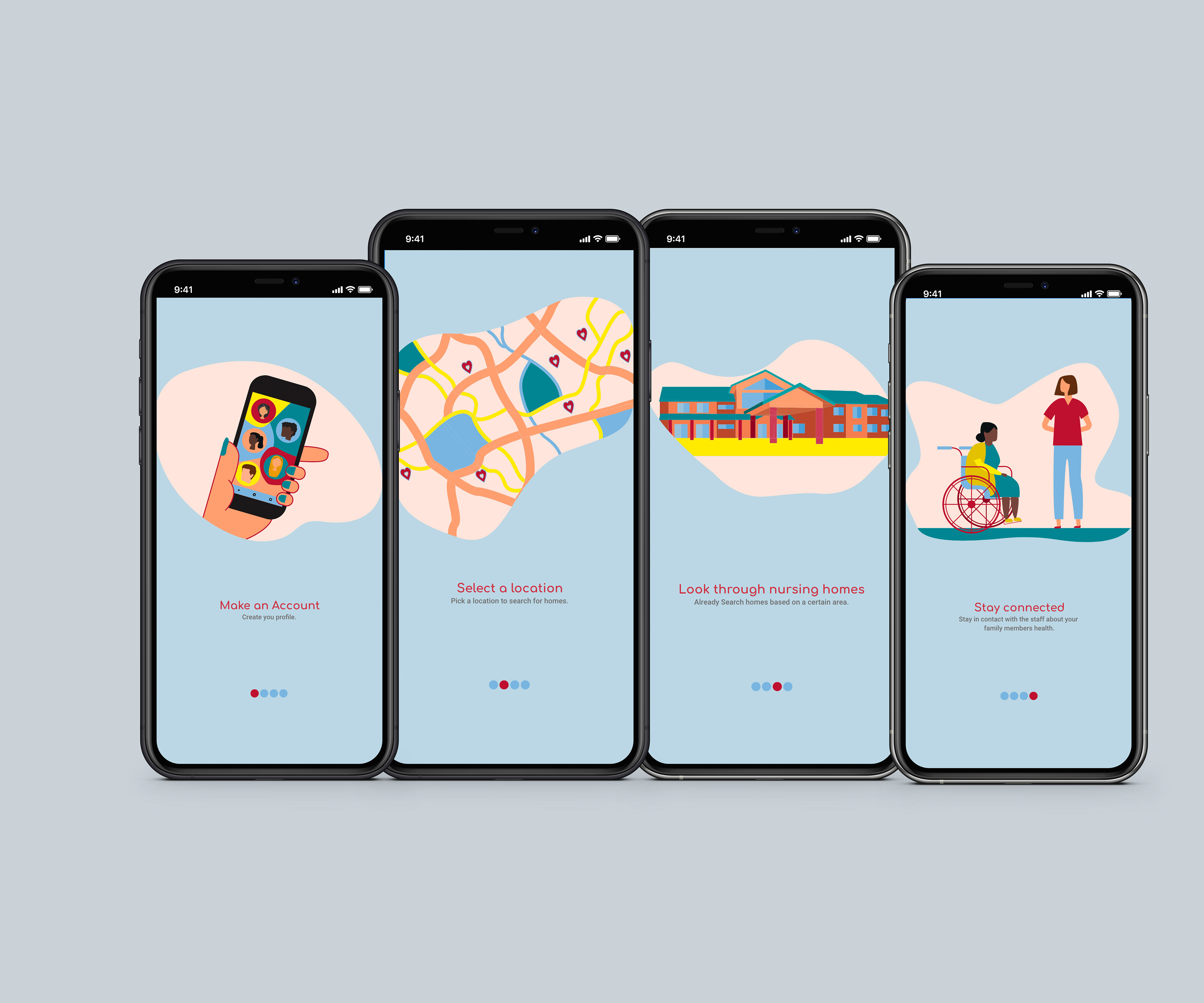
Onboarding
Onboarding is the user’s first impression of the app. If it is well designed it will increase the chances of people downloading the app. Once a user opens the app for the first time the onboarding will show the value in the app and the key elements and features used on the app.
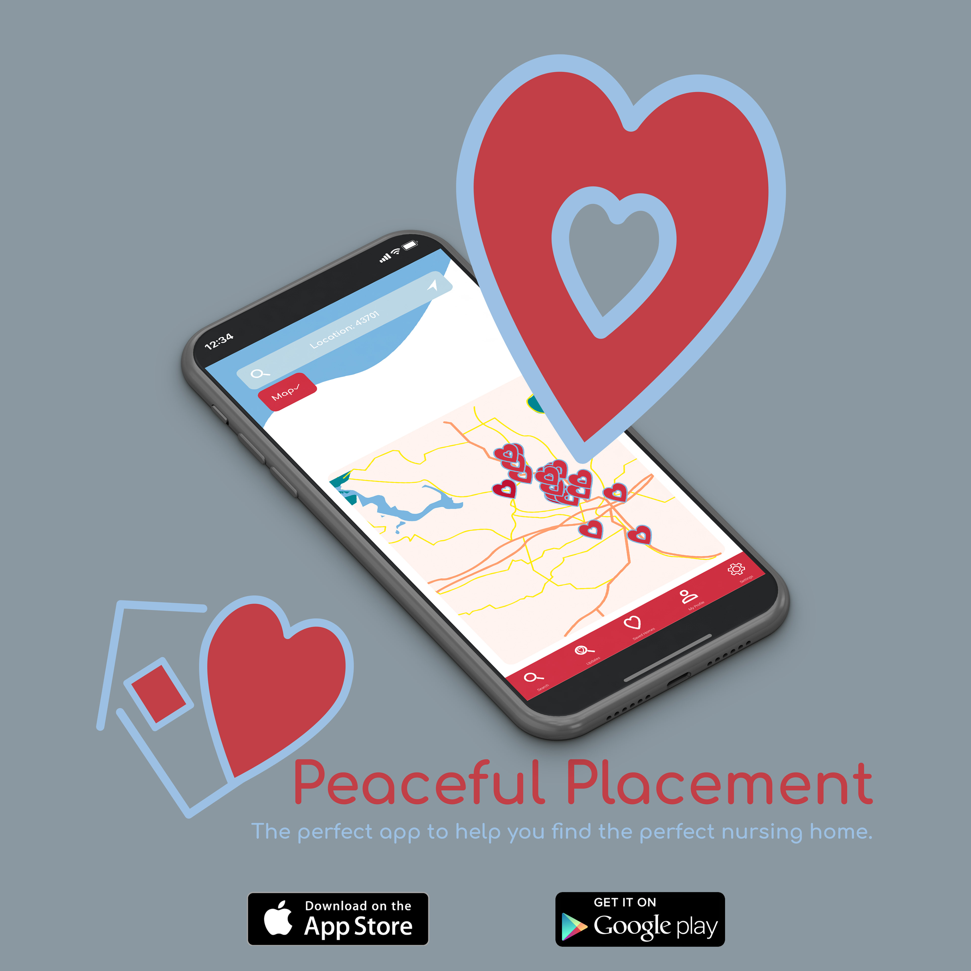
Social Media Ad
This ad was created to draw in more users and encourage them to download the app once they see it.
Digital Booklet Link